
Dashboard
Related information
Global view
A dashboard displays sharp and easy-to-read indicator results based on a configuration of tiles. As illustrated below, it is made of one to many sections that group indicator results by Data Element Concept (Table, Field, Workflow, dataspace, etc.). A coding color allows you to alert the user on unexpected or specific indicators values.
Note:
When you launch a dashboard from a table, the dashboard display prioritizes indicators related to the table.
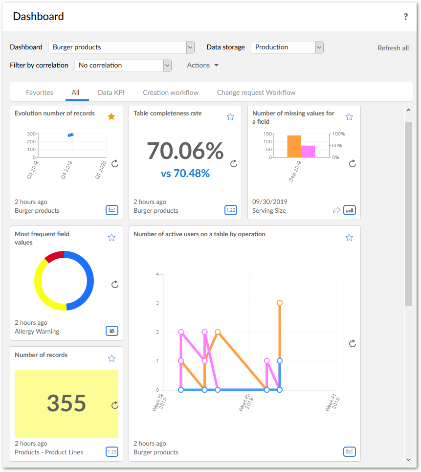
The tiles are configured in the Dashboard configuration domain of the TIBCO EBX® Insight Add-on data model (** Administration** area of EBX®). The rest of this section highlights how to configure a dashboard.
You can make it easier to monitor dashboard indicators by configuring tile background colors that display when watchdogs are raised. Please refer to the Configuration section under the Dashboard heading.
You can also monitor correlated watchdog indicators in the dashboard. You can filter tiles of an executed correlation.
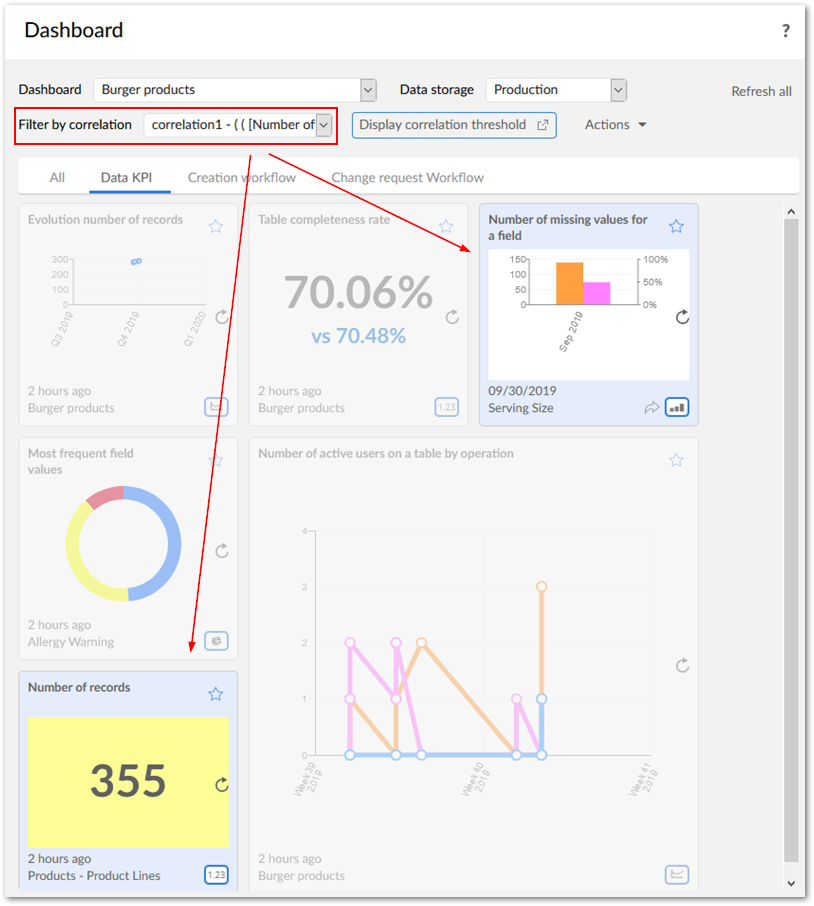
You must configure watchdog indicators and correlated watchdog indicators before using them in the dashboard. Please refer to the Configuration of the Correlated watchdog configuration section.
Expanding dashboard tiles
You can double-click a chart to expand it. The following sections highlight functionality for expanded charts.
Expanded Line and bar charts
The following highlights features when interacting with line charts; bar charts, and sparkline charts (not shown) share similar features and functionality:
-
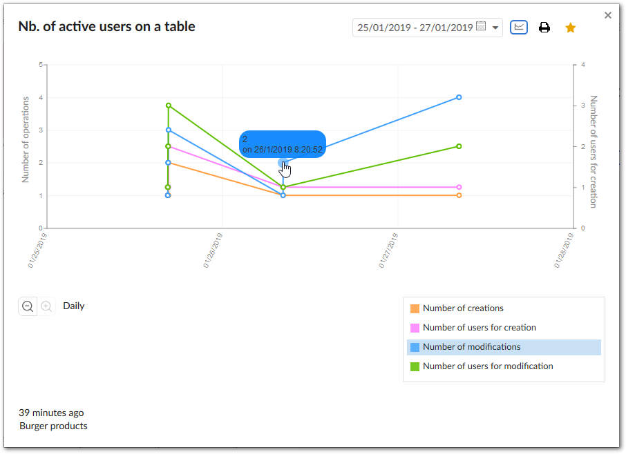
You can select an entry in the legend to toggle display of the corresponding line/bar. If you hover your mouse over an entry in the legend, the add-on highlights the associated line/bar. You can also hover over points/bars on the chart to display details.
-
As highlighted in the above image, you can filter display of lines/bars. Since the output displayed on the graph may no longer match the labels, the add-on automatically updates the displayed label to the optimal location.
-
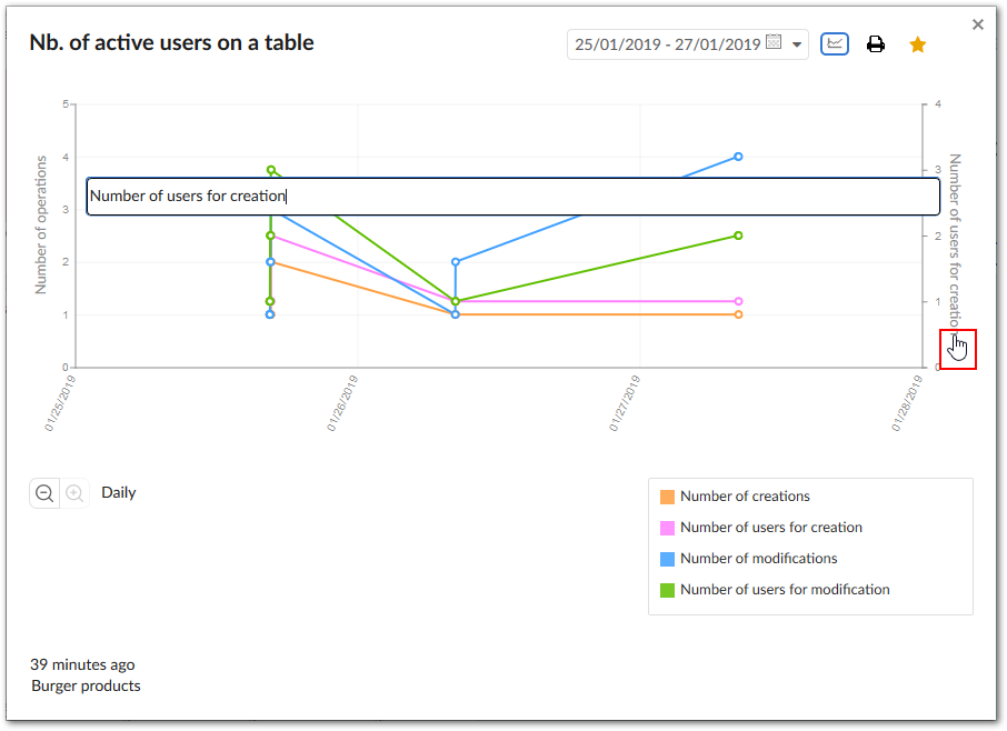
If enabled, users can click the axis label to edit it while viewing the indicator (shown below). Administrators can enable this functionality in the Dashboard configuration > Permission table by setting the Is allowed to edit axis label property to Yes.
-
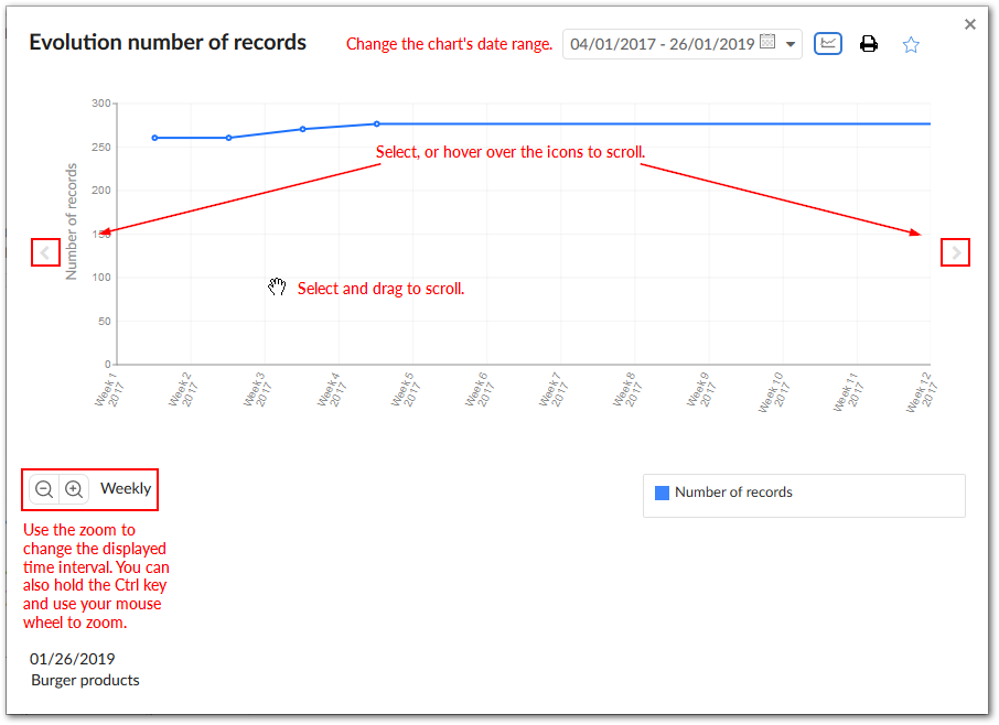
With line and bar charts you can change the date range using the menu at the top of the chart. You can also change the time interval displayed on the chart by zooming in and out. If there is too much data to display at the chart's current level, you can use the chart's scroll feature to view the desired data. You can scroll by:
-
Clicking a scroll icon to advance in intervals.
-
Hovering over a scroll icon.
-
Selecting and dragging the chart.
-
Pie charts
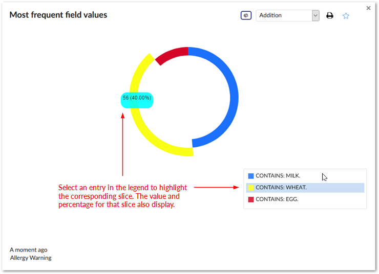
As shown below, pie charts enable functionality similar to line and bar charts, with subtle differences.
Dashboards integrated inside the EBX® Information Governance Add-on
To show indicators for tables and fields you register them with the EBX® Insight Add-on. If these tables and fields correspond to Administered Items, the indicators also display in the EBX® Information Governance Add-on's Quality tab.
Dashboard export
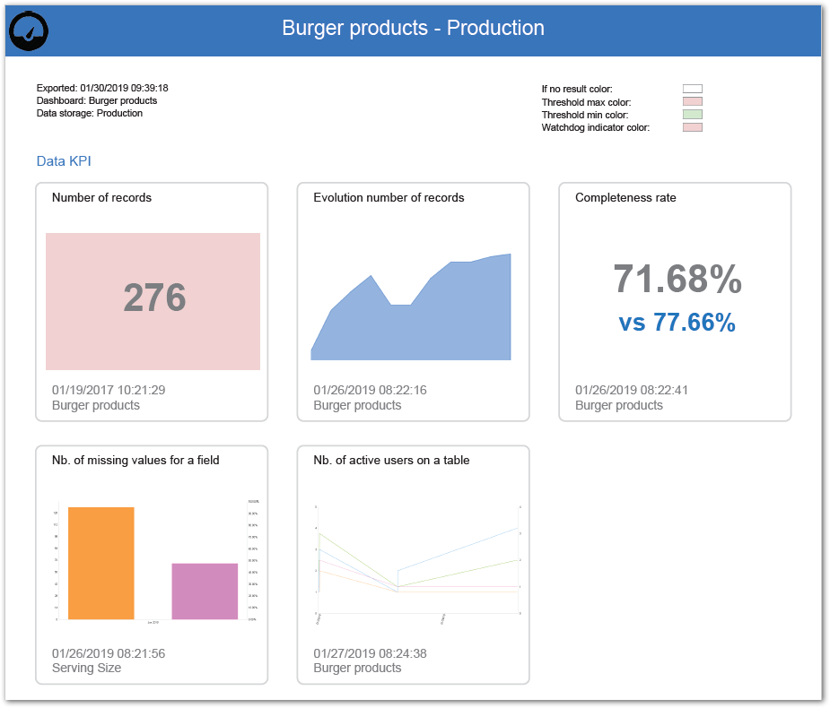
A dashboard can be configured to be exported to the PDF format. Please refer to the Reference data tables section for the configuration for more information. As shown below, the exported file provides an overview of the whole dashboard and detailed views of all tiles:
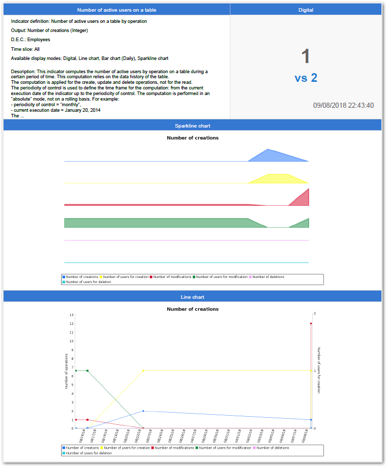
In addition to the dashboard overview, the PDF file contains detailed pages on individual indicators. The image below shows an example:
The add-on also provides an API to perform the same operation without accessing the Dashboard service. Additionally, you can customize the PDF content. Please refer to the add-on's API documentation for more information.
Permission and display rules
Permission
A dashboard is under the permission applied to a user-profile (refer to the configuration below). The content of the dashboard, namely the tiles, are under the control of the standard permission applied by the add-on (refer to the section Permission management).
Display rules
When the dashboard service is selected from the EBX® tool bar, the user's default dashboard displays. The user can also select from a list of available dashboards.
Configuration
Dashboard
A dashboard is made of one to many tiles. Every tile is related to one indicator, and grouped by section. A tile is displayed by enforcing some coding colors that are defined in the dashboard configuration.
Note:
After creating a dashboard, administrators can select the dashboard's settings icon to update configuration options.
Table 29: Dashboard configuration - Dashboard
Section
Sections are used to group indicators on a dashboard. Dashboards can contain multiple sections and a section can be used in multiple dashboards.
| Property | Definition |
|---|---|
| Code | An auto-incremented value generated by the add-on. |
| Label | Label that appears in the display of the dashboard. |
Table 30: Dashboard configuration - Section
Indicators in section
|
Property
|
Definition
|
|---|---|
|
Dashboard section
|
Selection of a dashboard section.
|
|
Indicator on D.E.C.
|
Selection of one 'Indicator on D.E.C.' for the selected section. The list is filtered by the D.E.C. attached to the section.
|
|
Tile size
|
Tile size
|
|
Available display modes
|
Available display modes of the tile in the dashboard.
At least one display mode must be selected.
|
|
Default display mode
|
Selection of the default display mode of the tile in the dashboard. The user can change the display mode manually if several modes are possible for the indicator, such as digital (direct figure), line chart, pie-chart, bar chart and sparkline chart.
The default display mode is limited to those available above.
|
|
Output parameter
|
Selection of the parameter that the tile will display.
|
|
Pie chart options
|
Selection of the pie chart options:
See also: 'Pie chart option's in the Indicator definition table
|
|
Automatic refresh on open
|
For an indicator with a computation frequency "On demand", it is possible to force indicator execution when the dashboard displays.
If set to 'True': the indicator automatically executes when the dashboard displays.
If set to 'False': the indicator does not execute when the dashboard displays.
|
|
Filter results by current user
|
If set to 'True': the results presented in the associated tile are filtered based on the user viewing the dashboard.
|
|
Separate tiles by group
|
When enabled, each group of indicator values displays on a separate tile. This option can be helpful when monitoring individual field values over time.
|
|
Hide when inactive
|
If set to 'True': the indicator should be hidden from the dashboard when 'Execution option/Active' in 'Indicator on DEC' table set to 'False'. Hence we will not remove the corresponding record in the 'Indicator in section' table.
If set to 'False': the indicator appear in the dashboard even when inactive (Default value).
|
Table 31: Dashboard configuration - Indicators in section
Sections in dashboard
The order of the sections in the dashboard is managed from the ordered data hierarchy (move up and move down services).
| Property | Definition |
|---|---|
| Dashboard | Selection of a dashboard. |
| Dashboard section | Selection of a section to include in the dashboard. |
Table 32: Dashboard configuration - Sections in dashboard
Permission
A dashboard is available under the condition the user has been permitted.
| Property | Definition |
|---|---|
| User profile | User-profile having the permission to access the dashboard. |
| Dashboard | Selection of one dashboard for which the selected user-profile is permitted. |
| Is default | When a user-profile is permitted to access to many dashboards, one can be set to display by default. |
| Default data storage | By default, the dashboard displays the indicators results from the selected data storage. |
| Is data storage selectable | If set to 'True': the user can select a data storage for displaying the dashboard. If set to 'False': only the default data storage is used for displaying the dashboard. The user can not select another data storage. |
| Is allowed to edit axis label | If set to 'True': user can edit chart axis's label In full screen mode on dashboard. If set to 'False': user is not allowed to edit chart axis label. |
Table 33: Dashboard configuration - Permission
Template
A template allows you to define the colors used by default to display the dashboards.
Table 34: Dashboard configuration - Template
Reference data tables
| Table | Definition |
|---|---|
| Export configuration | Basic information regarding the owner of the PDF file exported from the dashboard, such as the company or organization. |
| Export template | Contains template(s) used to generate dashboards to PDF files. |
Table 35: Dashboard configuration - Reference data tables
Working with sections and indicator tiles
If you have administrative privileges, you can add and remove sections and indicators from the dashboard UI. You can also edit indicator configuration options in the dashboard. The following headings describe these options:
Adding and removing sections
To add a section to an open dashboard:
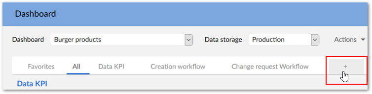
-
Select the + icon next to the list of dashboard sections.
-
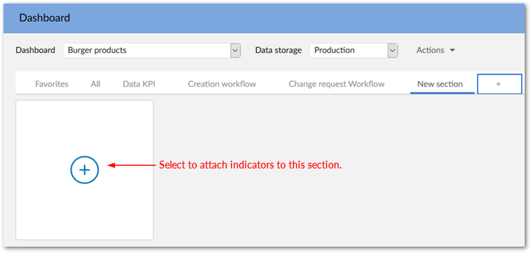
A new section displays. See Adding and removing indicator tiles for information on adding indicators to this section.
-
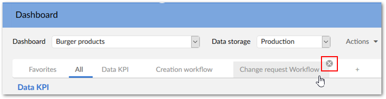
Optionally, double-click the new section tab and enter a name.To remove a section, mouse over the desired section and select the X that displays. The add-on presents you with a confirmation dialog.
Adding and removing indicator tiles
To add an indicator to a section in a dashboard:
-
Select the New indicator tile.
-
Fill in the required fields.
-
After selecting Add the new indicator tile displays in the section.
Note:
Using the above method to add an indicator automatically adds the required records to the Indicator on DEC and Indicator in section tables.
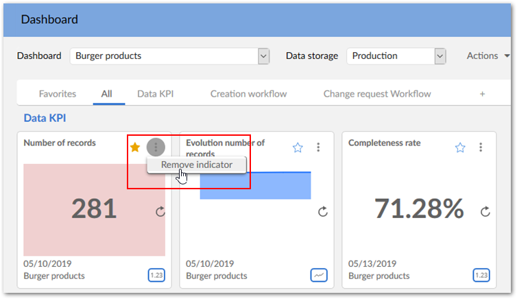
To remove an indicator from a section, open the menu in the indicator's title and select Remove indicator.
Note:
When you remove an indicator, the add-on deletes the corresponding records in the Indicator in section and Tile preference tables.
Editing indicator configuration options
You can edit indicator configuration options directly from the dashboard. This alleviates you from having to navigate the tables in the Administration area. To change indicator configuration options:
-
Open the menu on the desired indicator tile and select Configure indicator.
-
In the configuration screen that displays, use the tabs to locate the settings you would like to change.
-
After selecting Save and close the indicator immediately reflects your changes.